Figures and Charts
What this handout is about
This handout will describe how to use figures and tables to present complicated information in a way that is accessible and understandable to your reader.
Do I need a figure/table?
When planning your writing, it is important to consider the best way to communicate information to your audience, especially if you plan to use data in the form of numbers, words, or images that will help you construct and support your argument. Generally speaking, data summaries may take the form of text, tables or figures. Most writers are familiar with textual data summaries and this is often the best way to communicate simple results. A good rule of thumb is to see if you can present your results clearly in a sentence or two. If so, a table or figure is probably unnecessary. If your data are too numerous or complicated to be described adequately in this amount of space, figures and tables can be effective ways of conveying lots of information without cluttering up your text. Additionally, they serve as quick references for your reader and can reveal trends, patterns, or relationships that might otherwise be difficult to grasp.
So what’s the difference between a table and a figure anyway?
Tables present lists of numbers or text in columns and can be used to synthesize existing literature, to explain variables, or to present the wording of survey questions. They are also used to make a paper or article more readable by removing numeric or listed data from the text. Tables are typically used to present raw data, not when you want to show a relationship between variables.
Figures are visual presentations of results. They come in the form of graphs, charts, drawings, photos, or maps. Figures provide visual impact and can effectively communicate your primary finding. Traditionally, they are used to display trends and patterns of relationship, but they can also be used to communicate processes or display complicated data simply. Figures should not duplicate the same information found in tables and vice versa.
Using tables
Tables are easily constructed using your word processor’s table function or a spread sheet program such as Excel. Elements of a table include the Legend or Title, Column Titles, and the Table Body (quantitative or qualitative data). They may also include subheadings and footnotes. Remember that it is just as important to think about the organization of tables as it is to think about the organization of paragraphs. A well-organized table allows readers to grasp the meaning of the data presented with ease, while a disorganized one will leave the reader confused about the data itself, or the significance of the data.
Title: Tables are headed by a number followed by a clear, descriptive title or caption. Conventions regarding title length and content vary by discipline. In the hard sciences, a lengthy explanation of table contents may be acceptable. In other disciplines, titles should be descriptive but short, and any explanation or interpretation of data should take place in the text. Be sure to look up examples from published papers within your discipline that you can use as a model. It may also help to think of the title as the “topic sentence” of the table—it tells the reader what the table is about and how it’s organized. Tables are read from the top down, so titles go above the body of the table and are left-justified.
Column titles: The goal of column headings is to simplify and clarify the table, allowing the reader to understand the components of the table quickly. Therefore, column titles should be brief and descriptive and should include units of analysis.
Table body: This is where your data are located, whether they are numerical or textual. Again, organize your table in a way that helps the reader understand the significance of the data. Be sure to think about what you want your readers to compare, and put that information in the column (up and down) rather than in the row (across). In other words, construct your table so that like elements read down, not across. When using numerical data with decimals, make sure that the decimal points line up. Whole numbers should line up on the right.
Other table elements
Tables should be labeled with a number preceding the table title; tables and figures are labeled independently of one another. Tables should also have lines demarcating different parts of the table (title, column headers, data, and footnotes if present). Gridlines or boxes should not be included in printed versions. Tables may or may not include other elements, such as subheadings or footnotes.
Quick reference for tables
Tables should be:
- Centered on the page.
- Numbered in the order they appear in the text.
- Referenced in the order they appear in the text.
- Labeled with the table number and descriptive title above the table.
- Labeled with column and/or row labels that describe the data, including units of measurement.
- Set apart from the text itself; text does not flow around the table.
Table 1. Physical characteristics of the Doctor in the new series of Doctor Who
|
Height |
Age (yrs.) |
|
|
Ninth Doctor |
6’0” |
41 |
|
Tenth Doctor |
6’1” |
35 |
|
Eleventh Doctor |
5’11” |
25 |
Table 2. Physical characteristics of the Doctor in the new series of Doctor Who
|
Personal Appearance |
Wardrobe |
|
|
Ninth Doctor |
Close-cropped hair
Blue eyes Slightly stockier build |
Black leather jacket
Dark colored, v-necked shirts Black combat boots |
|
Tenth Doctor |
Longer, mussed-up hair
Brown eyes Very thin build |
Beige trench coat
Pin-striped suit and tie Chuck Taylors |
|
Eleventh Doctor |
Longer, side-swept hair
Green eyes Slightly stockier build |
Brown tweed jacket
Bow tie and suspenders Black Boots |
Using figures
Figures can take many forms. They may be graphs, diagrams, photos, drawings, or maps. Think deliberately about your purpose and use common sense to choose the most effective figure for communicating the main point. If you want your reader to understand spatial relationships, a map or photograph may be the best choice. If you want to illustrate proportions, experiment with a pie chart or bar graph. If you want to illustrate the relationship between two variables, try a line graph or a scatterplot (more on various types of graphs below). Although there are many types of figures, like tables, they share some typical features: captions, the image itself, and any necessary contextual information (which will vary depending on the type of figure you use).
Figure captions
Figures should be labeled with a number followed by a descriptive caption or title. Captions should be concise but comprehensive. They should describe the data shown, draw attention to important features contained within the figure, and may sometimes also include interpretations of the data. Figures are typically read from the bottom up, so captions go below the figure and are left-justified.
Image
The most important consideration for figures is simplicity. Choose images the viewer can grasp and interpret clearly and quickly. Consider size, resolution, color, and prominence of important features. Figures should be large enough and of sufficient resolution for the viewer to make out details without straining their eyes. Also consider the format your paper will ultimately take. Journals typically publish figures in black and white, so any information coded by color will be lost to the reader. On the other hand, color might be a good choice for papers published to the web or for PowerPoint presentations. In any case, use figure elements like color, line, and pattern for effect, not for flash.
Additional information
Figures should be labeled with a number preceding the table title; tables and figures are numbered independently of one another. Also be sure to include any additional contextual information your viewer needs to understand the figure. For graphs, this may include labels, a legend explaining symbols, and vertical or horizontal tick marks. For maps, you’ll need to include a scale and north arrow. If you’re unsure about contextual information, check out several types of figures that are commonly used in your discipline.
Quick reference for figures
Figures should be:
- Centered on the page.
- Labeled (under the figure) with the figure number and appropriate descriptive title (“Figure” can be spelled out [“Figure 1.”] or abbreviated [“Fig. 1.”] as long as you are consistent).
- Numbered in the order they appear in the text.
- Referenced in the order they appear in the text (i.e. Figure 1 is referenced in the text before Figure 2 and so forth).
- Set apart from the text; text should not flow around figures.
Graphs
Every graph is a figure but not every figure is a graph. Graphs are a particular set of figures that display quantitative relationships between variables. Some of the most common graphs include bar charts, frequency histograms, pie charts, scatter plots, and line graphs, each of which displays trends or relationships within and among datasets in a different way. You’ll need to carefully choose the best graph for your data and the relationship that you want to show. More details about some common graph types are provided below. Some good advice regarding the construction of graphs is to keep it simple. Remember that the main objective of your graph is communication. If your viewer is unable to visually decode your graph, then you have failed to communicate the information contained within it.
Pie charts
Pie charts are used to show relative proportions, specifically the relationship of a number of parts to the whole. Use pie charts only when the parts of the pie are mutually exclusive categories and the sum of parts adds up to a meaningful whole (100% of something). Pie charts are good at showing “big picture” relationships (i.e. some categories make up “a lot” or “a little” of the whole thing). However, if you want your reader to discern fine distinctions within your data, the pie chart is not for you. Humans are not very good at making comparisons based on angles. We are much better at comparing length, so try a bar chart as an alternative way to show relative proportions. Additionally, pie charts with lots of little slices or slices of very different sizes are difficult to read, so limit yours to 5-7 categories.
Examples of bad pie charts:
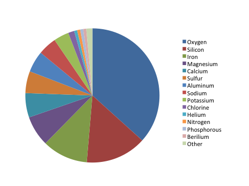
Figure 1. Elements in Martian soil
The chart shows the relative proportion of fifteen elements in Martian soil, listed in order from “most” to “least”: oxygen, silicon, iron, magnesium, calcium, sulfur, aluminum, sodium, potassium, chlorine, helium, nitrogen, phosphorus, beryllium, and other. Oxygen makes up about ⅓ of the composition, while silicon and iron together make up about ¼. The remaining slices make up smaller proportions, but the percentages aren’t listed in the key and are difficult to estimate. It is also hard to distinguish fifteen colors when comparing the pie chart to the color coded key.
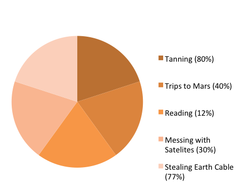
Figure 2. Leisure activities of Venusian teenagers
The chart shows the relative proportion of five leisure activities of Venusian teenagers (tanning, trips to Mars, reading, messing with satellites, and stealing Earth cable). Although each of the five slices are about the same size (roughly 20% of the total), the percentage of Venusian teenagers engaging in each activity varies widely (tanning: 80%, trips to Mars: 40%, reading: 12%, messing with satellites: 30%, stealing Earth cable: 77%). Therefore, there is a mismatch between the labels and the actual proportion represented by each activity (in other words, if reading represents 12% of the total, its slice should take up 12% of the pie chart area), which makes the representation inaccurate. In addition, the labels for the five slices add up to 239% (rather than 100%), which makes it impossible to accurately represent this dataset using a pie chart.
Bar graphs
Bar graphs are also used to display proportions. In particular, they are useful for showing the relationship between independent and dependent variables, where the independent variables are discrete (often nominal) categories. Some examples are occupation, gender, and species. Bar graphs can be vertical or horizontal. In a vertical bar graph the independent variable is shown on the x axis (left to right) and the dependent variable on the y axis (up and down). In a horizontal one, the dependent variable will be shown on the horizontal (x) axis, the independent on the vertical (y) axis. The scale and origin of the graph should be meaningful. If the dependent (numeric) variable has a natural zero point, it is commonly used as a point of origin for the bar chart. However, zero is not always the best choice. You should experiment with both origin and scale to best show the relevant trends in your data without misleading the viewer in terms of the strength or extent of those trends.
Example of a bar graph:
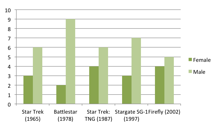
Figure 3. Genders of spaceship crew members in popular television series
The graph shows the number of male and female spaceship crew members for five different popular television series: Star Trek (1965), Battlestar (1978), Star Trek: TNG (1987), Stargate SG-1 (1997), and Firefly (2002). Because the television series are arranged chronologically on the x-axis, the graph can also be used to look for trends in these numbers over time.
Although the number of crew members for each show is similar (ranging from 9 to 11), the proportion of female and male crew members varies. Star Trek has half as many female crew members as male crew members (3 and 6, respectively), Battlestar has fewer than one-fourth as many female crew members as male crew members (2 and 9, respectively), Star Trek: TNG has four female crew members and six male crew members, Stargate SG-1 has less than one-half as many female crew members as male crew members (3 and 7, respectively), and Firefly has four female and five male crew members.
Frequency histograms/distributions
Frequency histograms are a special type of bar graph that show the relationship between independent and dependent variables, where the independent variable is continuous, rather than discrete. This means that each bar represents a range of values, rather than a single observation. The dependent variables in a histogram are always numeric, but may be absolute (counts) or relative (percentages). Frequency histograms are good for describing populations—examples include the distribution of exam scores for students in a class or the age distribution of the people living in Chapel Hill. You can experiment with bar ranges (also known as “bins”) to achieve the best level of detail, but each range or bin should be of uniform width and clearly labeled.
XY scatter plots
Scatter plots are another way to illustrate the relationship between two variables. In this case, data are displayed as points in an x,y coordinate system, where each point represents one observation along two axes of variation. Often, scatter plots are used to illustrate correlation between two variables—as one variable increases, the other increases (positive correlation) or decreases (negative correlation). However, correlation does not necessarily imply that changes in one variable cause changes in the other. For instance, a third, unplotted variable may be causing both. In other words, scatter plots can be used to graph one independent and one dependent variable, or they can be used to plot two independent variables. In cases where one variable is dependent on another (for example, height depends partly on age), plot the independent variable on the horizontal (x) axis, and the dependent variable on the vertical (y) axis. In addition to correlation (a linear relationship), scatter plots can be used to plot non-linear relationships between variables.
Example of a scatter plot:
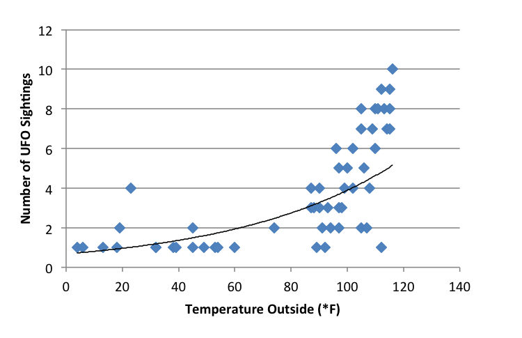
Figure 4. The effect of weather on UFO sightings
The scatter plot shows the relationship between temperature (x-axis, independent variable) and the number of UFO sightings (y-axis, dependent variable) for 53 separate data points. The temperature ranges from about 0°F and 120°F, and the number of UFO sightings ranges from 1 to 10. The plot shows a low number of UFO sightings (ranging from 1 to 4) at temperatures below 80°F and a much wider range of the number of sightings (from 1 to 10) at temperatures above 80°F. It appears that the number of sightings tends to increase as temperature increases, though there are many cases where only a few sightings occur at high temperatures.
XY line graphs
Line graphs are similar to scatter plots in that they display data along two axes of variation. Line graphs, however, plot a series of related values that depict a change in one variable as a function of another, for example, world population (dependent) over time (independent). Individual data points are joined by a line, drawing the viewer’s attention to local change between adjacent points, as well as to larger trends in the data. Line graphs are similar to bar graphs, but are better at showing the rate of change between two points. Line graphs can also be used to compare multiple dependent variables by plotting multiple lines on the same graph.
Example of an XY line graph:
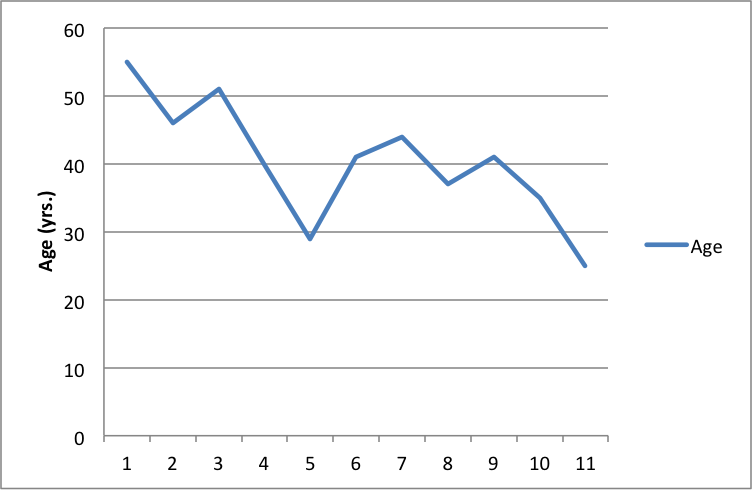
Figure 5. Age of the actor of each Doctor Who regeneration (1-11)
The line graph shows the age (in years) of the actor of each Doctor Who regeneration for the first through the eleventh regeneration. The ages range from a maximum of about 55 in the first regeneration to a minimum of about 25 in the eleventh regeneration. There is a downward trend in the age of the actors over the course of the eleven regenerations.
General tips for graphs
Strive for simplicity. Your data will be complex. Don’t be tempted to convey the complexity of your data in graphical form. Your job (and the job of your graph) is to communicate the most important thing about the data. Think of graphs like you think of paragraphs—if you have several important things to say about your data, make several graphs, each of which highlights one important point you want to make.
Strive for clarity. Make sure that your data are portrayed in a way that is visually clear. Make sure that you have explained the elements of the graph clearly. Consider your audience. Will your reader be familiar with the type of figure you are using (such as a boxplot)? If not, or if you’re not sure, you may need to explain boxplot conventions in the text. Avoid “chartjunk.” Superfluous elements just make graphs visually confusing. Your reader does not want to spend 15 minutes figuring out the point of your graph.
Strive for accuracy. Carefully check your graph for errors. Even a simple graphical error can change the meaning and interpretation of the data. Use graphs responsibly. Don’t manipulate the data so that it looks like it’s saying something it’s not—savvy viewers will see through this ruse, and you will come off as incompetent at best and dishonest at worst.
How should tables and figures interact with text?
Placement of figures and tables within the text is discipline-specific. In manuscripts (such as lab reports and drafts) it is conventional to put tables and figures on separate pages from the text, as near as possible to the place where you first refer to it. You can also put all the figures and tables at the end of the paper to avoid breaking up the text. Figures and tables may also be embedded in the text, as long as the text itself isn’t broken up into small chunks. Complex raw data is conventionally presented in an appendix. Be sure to check on conventions for the placement of figures and tables in your discipline.
You can use text to guide the reader in interpreting the information included in a figure, table, or graph—tell the reader what the figure or table conveys and why it was important to include it.
When referring to tables and graphs from within the text, you can use:
- Clauses beginning with “as”: “As shown in Table 1, …”
- Passive voice: “Results are shown in Table 1.”
- Active voice (if appropriate for your discipline): “Table 1 shows that …”
- Parentheses: “Each sample tested positive for three nutrients (Table 1).”
Works consulted
We consulted these works while writing this handout. This is not a comprehensive list of resources on the handout’s topic, and we encourage you to do your own research to find additional publications. Please do not use this list as a model for the format of your own reference list, as it may not match the citation style you are using. For guidance on formatting citations, please see the UNC Libraries citation tutorial. We revise these tips periodically and welcome feedback.
American Psychological Association. 2010. Publication Manual of the American Psychological Association. 6th ed. Washington, DC: American Psychological Association.
Bates College. 2012. “Almost everything you wanted to know about making tables and figures.” How to Write a Paper in Scientific Journal Style and Format, January 11, 2012. http://abacus.bates.edu/~ganderso/biology/resources/writing/HTWtablefigs.html.
Cleveland, William S. 1994. The Elements of Graphing Data, 2nd ed. Summit, NJ: Hobart Press..
Council of Science Editors. 2014. Scientific Style and Format: The CSE Manual for Authors, Editors, and Publishers, 8th ed. Chicago & London: University of Chicago Press.
University of Chicago Press. 2017. The Chicago Manual of Style, 17th ed. Chicago & London: University of Chicago Press.
This work is licensed under CC BY-NC-ND 4.0
You may reproduce it for non-commercial use if you use the entire handout and attribute the source: The Writing Center, University of North Carolina at Chapel Hill
