Statistics
There are lies, damned lies, and statistics.
—Mark Twain
What this handout is about
The purpose of this handout is to help you use statistics to make your argument as effectively as possible.
Introduction
Numbers are power. Apparently freed of all the squishiness and ambiguity of words, numbers and statistics are powerful pieces of evidence that can effectively strengthen any argument. But statistics are not a panacea. As simple and straightforward as these little numbers promise to be, statistics, if not used carefully, can create more problems than they solve.
Many writers lack a firm grasp of the statistics they are using. The average reader does not know how to properly evaluate and interpret the statistics he or she reads. The main reason behind the poor use of statistics is a lack of understanding about what statistics can and cannot do. Many people think that statistics can speak for themselves. But numbers are as ambiguous as words and need just as much explanation.
In many ways, this problem is quite similar to that experienced with direct quotes. Too often, quotes are expected to do all the work and are treated as part of the argument, rather than a piece of evidence requiring interpretation (see our handout on how to quote.) But if you leave the interpretation up to the reader, who knows what sort of off-the-wall interpretations may result? The only way to avoid this danger is to supply the interpretation yourself.
But before we start writing statistics, let’s actually read a few.
Reading statistics
As stated before, numbers are powerful. This is one of the reasons why statistics can be such persuasive pieces of evidence. However, this same power can also make numbers and statistics intimidating. That is, we too often accept them as gospel, without ever questioning their veracity or appropriateness. While this may seem like a positive trait when you plug them into your paper and pray for your reader to submit to their power, remember that before we are writers of statistics, we are readers. And to be effective readers means asking the hard questions. Below you will find a useful set of hard questions to ask of the numbers you find.
1. Does your evidence come from reliable sources?
This is an important question not only with statistics, but with any evidence you use in your papers. As we will see in this handout, there are many ways statistics can be played with and misrepresented in order to produce a desired outcome. Therefore, you want to take your statistics from reliable sources (for more information on finding reliable sources, please see our handout on evaluating print sources). This is not to say that reliable sources are infallible, but only that they are probably less likely to use deceptive practices. With a credible source, you may not need to worry as much about the questions that follow. Still, remember that reading statistics is a bit like being in the middle of a war: trust no one; suspect everyone.
2. What is the data’s background?
Data and statistics do not just fall from heaven fully formed. They are always the product of research. Therefore, to understand the statistics, you should also know where they come from. For example, if the statistics come from a survey or poll, some questions to ask include:
- Who asked the questions in the survey/poll?
- What, exactly, were the questions?
- Who interpreted the data?
- What issue prompted the survey/poll?
- What (policy/procedure) potentially hinges on the results of the poll?
- Who stands to gain from particular interpretations of the data?
All these questions help you orient yourself toward possible biases or weaknesses in the data you are reading. The goal of this exercise is not to find “pure, objective” data but to make any biases explicit, in order to more accurately interpret the evidence.
3. Are all data reported?
In most cases, the answer to this question is easy: no, they aren’t. Therefore, a better way to think about this issue is to ask whether all data have been presented in context. But it is much more complicated when you consider the bigger issue, which is whether the text or source presents enough evidence for you to draw your own conclusion. A reliable source should not exclude data that contradicts or weakens the information presented.
An example can be found on the evening news. If you think about ice storms, which make life so difficult in the winter, you will certainly remember the newscasters warning people to stay off the roads because they are so treacherous. To verify this point, they tell you that the Highway Patrol has already reported 25 accidents during the day. Their intention is to scare you into staying home with this number. While this number sounds high, some studies have found that the number of accidents actually goes down on days with severe weather. Why is that? One possible explanation is that with fewer people on the road, even with the dangerous conditions, the number of accidents will be less than on an “average” day. The critical lesson here is that even when the general interpretation is “accurate,” the data may not actually be evidence for the particular interpretation. This means you have no way to verify if the interpretation is in fact correct.
There is generally a comparison implied in the use of statistics. How can you make a valid comparison without having all the facts? Good question. You may have to look to another source or sources to find all the data you need.
4. Have the data been interpreted correctly?
If the author gives you her statistics, it is always wise to interpret them yourself. That is, while it is useful to read and understand the author’s interpretation, it is merely that—an interpretation. It is not the final word on the matter. Furthermore, sometimes authors (including you, so be careful) can use perfectly good statistics and come up with perfectly bad interpretations. Here are two common mistakes to watch out for:
- Confusing correlation with causation. Just because two things vary together does not mean that one of them is causing the other. It could be nothing more than a coincidence, or both could be caused by a third factor. Such a relationship is called spurious.The classic example is a study that found that the more firefighters sent to put out a fire, the more damage the fire did. Yikes! I thought firefighters were supposed to make things better, not worse! But before we start shutting down fire stations, it might be useful to entertain alternative explanations. This seemingly contradictory finding can be easily explained by pointing to a third factor that causes both: the size of the fire. The lesson here? Correlation does not equal causation. So it is important not only to think about showing that two variables co-vary, but also about the causal mechanism.
- Ignoring the margin of error. When survey results are reported, they frequently include a margin of error. You might see this written as “a margin of error of plus or minus 5 percentage points.” What does this mean? The simple story is that surveys are normally generated from samples of a larger population, and thus they are never exact. There is always a confidence interval within which the general population is expected to fall. Thus, if I say that the number of UNC students who find it difficult to use statistics in their writing is 60%, plus or minus 4%, that means, assuming the normal confidence interval of 95%, that with 95% certainty we can say that the actual number is between 56% and 64%.
Why does this matter? Because if after introducing this handout to the students of UNC, a new poll finds that only 56%, plus or minus 3%, are having difficulty with statistics, I could go to the Writing Center director and ask for a raise, since I have made a significant contribution to the writing skills of the students on campus. However, she would no doubt point out that a) this may be a spurious relationship (see above) and b) the actual change is not significant because it falls within the margin of error for the original results. The lesson here? Margins of error matter, so you cannot just compare simple percentages.
Finally, you should keep in mind that the source you are actually looking at may not be the original source of your data. That is, if you find an essay that quotes a number of statistics in support of its argument, often the author of the essay is using someone else’s data. Thus, you need to consider not only your source, but the author’s sources as well.
Writing statistics
As you write with statistics, remember your own experience as a reader of statistics. Don’t forget how frustrated you were when you came across unclear statistics and how thankful you were to read well-presented ones. It is a sign of respect to your reader to be as clear and straightforward as you can be with your numbers. Nobody likes to be played for a fool. Thus, even if you think that changing the numbers just a little bit will help your argument, do not give in to the temptation.
As you begin writing, keep the following in mind. First, your reader will want to know the answers to the same questions that we discussed above. Second, you want to present your statistics in a clear, unambiguous manner. Below you will find a list of some common pitfalls in the world of statistics, along with suggestions for avoiding them.
1. The mistake of the “average” writer
Nobody wants to be average. Moreover, nobody wants to just see the word “average” in a piece of writing. Why? Because nobody knows exactly what it means. There are not one, not two, but three different definitions of “average” in statistics, and when you use the word, your reader has only a 33.3% chance of guessing correctly which one you mean.
For the following definitions, please refer to this set of numbers: 5, 5, 5, 8, 12, 14, 21, 33, 38
- Mean (arithmetic mean)
This may be the most average definition of average (whatever that means). This is the weighted average—a total of all numbers included divided by the quantity of numbers represented. Thus the mean of the above set of numbers is 5+5+5+8+12+14+21+33+38, all divided by 9, which equals 15.644444444444 (Wow! That is a lot of numbers after the decimal—what do we do about that? Precision is a good thing, but too much of it is over the top; it does not necessarily make your argument any stronger. Consider the reasonable amount of precision based on your input and round accordingly. In this case, 15.6 should do the trick.)
- Median
Depending on whether you have an odd or even set of numbers, the median is either a) the number midway through an odd set of numbers or b) a value halfway between the two middle numbers in an even set. For the above set (an odd set of 9 numbers), the median is 12. (5, 5, 5, 8 < 12 < 14, 21, 33, 38)
- Mode
The mode is the number or value that occurs most frequently in a series. If, by some cruel twist of fate, two or more values occur with the same frequency, then you take the mean of the values. For our set, the mode would be 5, since it occurs 3 times, whereas all other numbers occur only once.
As you can see, the numbers can vary considerably, as can their significance. Therefore, the writer should always inform the reader which average he or she is using. Otherwise, confusion will inevitably ensue.
2. Match your facts with your questions
Be sure that your statistics actually apply to the point/argument you are making. If we return to our discussion of averages, depending on the question you are interesting in answering, you should use the proper statistics.
Perhaps an example would help illustrate this point. Your professor hands back the midterm. The grades are distributed as follows:
| Grade | # Received |
| 100 | 4 |
| 98 | 5 |
| 95 | 2 |
| 63 | 4 |
| 58 | 6 |
The professor felt that the test must have been too easy, because the average (median) grade was a 95.
When a colleague asked her about how the midterm grades came out, she answered, knowing that her classes were gaining a reputation for being “too easy,” that the average (mean) grade was an 80.
When your parents ask you how you can justify doing so poorly on the midterm, you answer, “Don’t worry about my 63. It is not as bad as it sounds. The average (mode) grade was a 58.”
I will leave it up to you to decide whether these choices are appropriate. Selecting the appropriate facts or statistics will help your argument immensely. Not only will they actually support your point, but they will not undermine the legitimacy of your position. Think about how your parents will react when they learn from the professor that the average (median) grade was 95! The best way to maintain precision is to specify which of the three forms of “average” you are using.
3. Show the entire picture
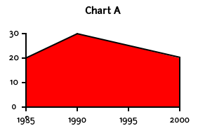
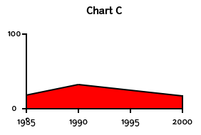
Sometimes, you may misrepresent your evidence by accident and misunderstanding. Other times, however, misrepresentation may be slightly less innocent. This can be seen most readily in visual aids. Do not shape and “massage” the representation so that it “best supports” your argument. This can be achieved by presenting charts/graphs in numerous different ways. Either the range can be shortened (to cut out data points which do not fit, e.g., starting a time series too late or ending it too soon), or the scale can be manipulated so that small changes look big and vice versa. Furthermore, do not fiddle with the proportions, either vertically or horizontally. The fact that USA Today seems to get away with these techniques does not make them OK for an academic argument.
 |
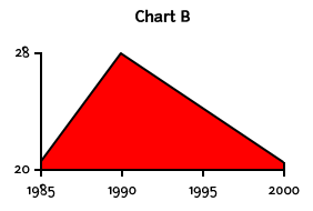 |
Charts A, B, and C all use the same data points, but the stories they seem to be telling are quite different. Chart A shows a mild increase, followed by a slow decline. Chart B, on the other hand, reveals a steep jump, with a sharp drop-off immediately following. Conversely, Chart C seems to demonstrate that there was virtually no change over time. These variations are a product of changing the scale of the chart. One way to alleviate this problem is to supplement the chart by using the actual numbers in your text, in the spirit of full disclosure.
 |
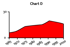
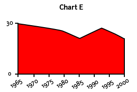
Another point of concern can be seen in Charts D and E. Both use the same data as charts A, B, and C for the years 1985-2000, but additional time points, using two hypothetical sets of data, have been added back to 1965. Given the different trends leading up to 1985, consider how the significance of recent events can change. In Chart D, the downward trend from 1990 to 2000 is going against a long-term upward trend, whereas in Chart E, it is merely the continuation of a larger downward trend after a brief upward turn.
 |
 |
One of the difficulties with visual aids is that there is no hard and fast rule about how much to include and what to exclude. Judgment is always involved. In general, be sure to present your visual aids so that your readers can draw their own conclusions from the facts and verify your assertions. If what you have cut out could affect the reader’s interpretation of your data, then you might consider keeping it.
4. Give bases of all percentages
Because percentages are always derived from a specific base, they are meaningless until associated with a base. So even if I tell you that after this reading this handout, you will be 23% more persuasive as a writer, that is not a very meaningful assertion because you have no idea what it is based on—23% more persuasive than what?
Let’s look at crime rates to see how this works. Suppose we have two cities, Springfield and Shelbyville. In Springfield, the murder rate has gone up 75%, while in Shelbyville, the rate has only increased by 10%. Which city is having a bigger murder problem? Well, that’s obvious, right? It has to be Springfield. After all, 75% is bigger than 10%.
Hold on a second, because this is actually much less clear than it looks. In order to really know which city has a worse problem, we have to look at the actual numbers. If I told you that Springfield had 4 murders last year and 7 this year, and Shelbyville had 30 murders last year and 33 murders this year, would you change your answer? Maybe, since 33 murders are significantly more than 7. One would certainly feel safer in Springfield, right?
Not so fast, because we still do not have all the facts. We have to make the comparison between the two based on equivalent standards. To do that, we have to look at the per capita rate (often given in rates per 100,000 people per year). If Springfield has 700 residents while Shelbyville has 3.3 million, then Springfield has a murder rate of 1,000 per 100,000 people, and Shelbyville’s rate is merely 1 per 100,000. Gadzooks! The residents of Springfield are dropping like flies. I think I’ll stick with nice, safe Shelbyville, thank you very much.
Percentages are really no different from any other form of statistics: they gain their meaning only through their context. Consequently, percentages should be presented in context so that readers can draw their own conclusions as you emphasize facts important to your argument. Remember, if your statistics really do support your point, then you should have no fear of revealing the larger context that frames them.
Important questions to ask (and answer) about statistics
- Is the question being asked relevant?
- Do the data come from reliable sources?
- Margin of error/confidence interval—when is a change really a change?
- Are all data reported, or just the best/worst?
- Are the data presented in context?
- Have the data been interpreted correctly?
- Does the author confuse correlation with causation?
Conclusion
Now that you have learned the lessons of statistics, you have two options. Use this knowledge to manipulate your numbers to your advantage, or use this knowledge to better understand and use statistics to make accurate and fair arguments. The choice is yours. Nine out of ten writers, however, prefer the latter, and the other one later regrets his or her decision.
This work is licensed under CC BY-NC-ND 4.0
You may reproduce it for non-commercial use if you use the entire handout and attribute the source: The Writing Center, University of North Carolina at Chapel Hill
